AngelPrint
About Angelprint | Toll Free: 1 888 7 MY ANGEL
Event Displays for Outdoor Events
If your company is appearing at a business event outdoors, you'll want to be sure you have displays that will look professional and will hold up whatever the weather may be. Instead of using your indoor displays, protect them and invest in a few outdoor displays.
Where to start for your outdoor event business display
1. Aluminum Snap Frame
2. Outdoor Banner Stand
Outdoor banners can be fun and interesting mediums to catch attention at even the most crowded events. Outdoor banner stands can rise above a cluttered line of sight so that the location of your company's booth is easily spotted. Amp up your event display with images from and/or the logo of your company for all to see!
3. Canopy
A company's booth at an event should invite people to stop, talk, and learn more about the products and services your company can provide. A canopy definitely invites people in and helps convey the feeling that you want them to have an experience, instead of quickly browse and then go on their way. Plus, a canopy can provide shade and a break from the weather so that your business can be an event favorite, even if the weather is not.
Need displays for your upcoming events, conventions, or trade shows? Call Angel Print at (760) 967-0492 or email us at info@angelprint.com.
How Your Company Can Save Time, Save Money, and Communicate Better.
Planning How Your Business Communicates With Your Target Markets
By Kevin Popović, Communications Director, Ideahaus®
Entrepreneurs know that a business plan is critical for funding. Marketers know that marketing plans are key to management and success. Sales pros have a plan to approach target markets, they wouldn’t dream of selling without it. But what about communications?
Yeah, there's a plan for that.
A true communications professional will have a document that shows what they have planned, when it goes live, and how long it impacts their audience. Add budgets and hours, and you have a document that keeps every department in the company on track, and every CEO in the loop. With every dollar critical, it would be irresponsible to not have something in place.
This is how we do it.
A couple caveats from the podium: First, this only works if you follow the process. Improvising along the way voids my warranty that this will deliver a comprehensive, efficient and strategic plan. Second, you only get out of it what you put into it. — kp
1. Review the Categories of Communications.
Create a list of the types of communication you’re documenting. Even in our meetings there’s an occasional, “Oh yeah, I didn’t think about that.” Throw everything in the pile to begin with — even the improbable.
Now talk about each of them.
Why? Because the word “communications” is like the word “art.” Everyone in both sales and marketing has their own, slightly different interpretation of what the word means to them based on their roles, and it skews depending on which department you come from.
2. Document Your Communications Assets.
Documentation starts with the items already in play. Assets that are bought and paid for, that can contribute towards a cohesive communications approach to each of your target markets: marketing, sales, events, web development, product development, etc. This includes your outside agencies too: public relations, advertising, production, media — everyone.
CEO Tip: Want to find out what really exists and what doesn’t? Ask for it and tell them you may want to use it next week for something. You’ll find out quickly if it does exist, and if it’s ready to go. — kp
3. Detail the Assets.
Having a list of assets is a start, but what about the details? Sure you’re sending an e-mail, but what’s it about You have a Facebook Place page but how do you get to it? Account for what your company does know and you’ll identify what you don’t know. Even this rough estimate provides more information than previously available.
4. Schedule the Assets in Play.
Each of the assets of your plan will be released on a specific date to your target audiences. Which date? What time? And who is responsible? This is where consideration begins for planning, development, creative, production, and media.
5. Estimate the Impact.
The impact of communications in the market space tends to include more than just the day it was released. E-mail sent on Monday may not get addressed until Wednesday. Print ads breaking on the first in a monthly trade publication attract readers for at least the first two weeks before trailing off.
Discuss these with your team to realistically estimate the impact of each piece with your target markets and update your plan to reflect the “coverage” created for the month.
CEO Tip: Some marketers have a hard time realizing one of their kids is uglier than another. Not every piece is going to be a star performer, and some are going to flop. David Ogilvy was noted for saying, “Half of my advertising is wasted, and the trouble is, I don’t know which half.” Be wary of false promises— set realistic expectations, and get excited when it performs better than expected. — kp
6. Estimate the Investments.
Most companies have limited resources and even more limited budgets. Understanding the impact of a plan on your company early can prevent turbulence later and keep your team moving forward.
To start here, assign hours to every item. How long will it take to update the e-mail? To update the social media platform? To edit the new video? Not sure? Guess. You can update this later, but with a first pass you can reasonably evaluate if your team can deliver on time.
And what about costs? Your salaried employees have a cost assigned to them. Outside costs are an even bigger concern.
7. Develop Your Strategy.
A strategic approach to a communications plan means something different to everyone you’ll ask. Calling for it here tells you when you’re prepared to discuss strategy, but not how you should do it.
Some think it’s more than just being book smart or college educated. ROI is critical, but a good strategy also includes efficiency, communicating well, and the ability to get the most out of every opportunity.
Better, Faster and Cheaper.
Every company communicates better with a plan. And although this may be easier for the experienced, it’s crucial for every business, and in the long run it saves time and money.
Invest the time to develop your communications and you’ll gain a perspective that improves what you say and how you say it. And in communications, isn’t that what it’s all about?
Want to learn more about communications planning? Contact Kevin Popović at kp@ideahaus.com or connect with him on LinkedIn.
Want to learn more about Ideahaus®? Visit the Ideahaus® website.
COMMUNICATION DESIGNED
Why take the time and money to design your marketplace communications? For the same reason you comb your hair. Or wear matching socks to work. Or make your elevator speech organized and compelling.
Your marketplace communications are your logo and tagline, your website, your letterhead and business card. If you have signage, posters, or banners, these are communications too. And so are brochures, newsletters, ads, mailers, and point-of-purchase items. These are the vehicles that express your message to customers, clients, and prospects. They are your ambassadors.
Most people think the only purpose of these vehicles is to convey information. If the website or mailer includes the company name, says what the company does, and gives contact information, then it’s a good communication.
Wrong. Very wrong.
Informative, accurate content is vital. But it’s not sufficient. Because looks matter. The way a communication is designed creates its own impression. Layout, size, graphics, images, typography, color scheme all say something about your company. They can enhance or undercut the words themselves. Subliminally.
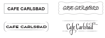
Here’s a simple case in point. I’ve stripped this restaurant sign down to its typeface. No color, no attention to graphics beyond the shape of the sign itself. Have a look:

The first thing to notice is that the two words in these signs are identical.
And yet, even with the same information, each has a distinctive “voice.” Each says something different about the business. That difference is in the design.
The signs aren’t just different. Two of them are better. For example, the upper left version is straightforward and legible; it’s also dull as a tall glass of sand. (Is the food dull too?) The upper right sign is an attempt to be cute and homey. But it’s illegible! We don’t pay attention to a business when we can’t read its name.
In the lower versions, some thought has been given to style. Both give the café an intriguing, appealing personality. They say something enticing about the food, the decor, the service. And they say it quietly. That’s how communication design works. Now just imagine what happens when color, graphics, and images are introduced.
So how do you evaluate a communication? How do you assess if its look and feel will enhance your business message or undercut it? That’s what we’ll be talking about in future posts. So stay tuned….
By Doug Katz
![]()
Doug Katz is the founder of JamArtz, an Encinitas, California branding and communication design studio. The firm has been creating artful identities, persuasive messages, and eye-catching communications for businesses, non-profits, and social causes since 1990. Visit jamartz.com or call 760.310.0517.
Printed Digital Books are the Wave of the Future
If you asked someone what a digital book was just a few years ago, they probably would have guessed that it was a book filled with numbers! But nothing could be further from the truth; a digital book looks just like any other book, but is printed with the latest digital technology.
This technology allows anyone to write a book and convert it into a computer file ready for printing. You don’t need to print a minimum of 2,500 copies like in the old days when books went on a big press—today you can print from one to a few thousand before the economics of long run printing kick in.
So what are these digital presses like? Years ago, people would have said they look like giant copy machines. However, recent generations of digital presses are so advanced that it is nearly impossible for most people to tell the difference between a book printed on one of them and a book printed on a traditional press.
Angel Print, Inc. in San Diego has several digital presses that do beautiful work, including a Xerox 5100, a Xerox 4112 and a Xerox Igen. Any of these digital presses would have made Johannes Gutenberg jump for joy because of their speed and because of the quality of the printed product they produce.
The Xerox 5100 is a well-known workhorse in the Xerox line. Angel Printing maintains one because it is a very cost effective way to produce short and medium digital press runs at low cost.
The Xerox 4112 is an amazing digital press, and is ideal for booklets. It can turn out hundreds of them, up to 80 pages each, saddle-stitched, in just a matter of minutes. It can accept a wide range of paper stocks, including coated, so it’s ideal for producing high quality short runs like instruction booklets or special reports. This digital press prints black and white but has the capacity to integrate color inserts during the printing process.
The digital press that really attracts attention at Angel Printing is the Xerox Igen. This monster is built like a Ferrari and is capable of turning out full color books. Of course, that’s not all it does. It also has the capability to print full-color magazines, catalogs, brochures, direct mail pieces, inserts and flyers, and it does it all with stunning graphic quality.
Angel Printing prints short-run books, and does all kinds of binding too—everything from wire bound and saddle stitching right up through perfect bound (paperback) and hard-cover books. Besides the quality of the books, the best part is that you can order them in the hundreds, if you wish, not in the thousands. That makes digital printing ideal for printing things like annual reports, software manuals, family or corporate histories, and advanced review copies (ARCs) of books that will be mass produced later.
Not only does Angel Printing have the equipment to produce quality short-run books, but they also have the talent. You can contact your Angel Printing customer service representative and get help at every step along the way. The Angel Printing team will help you produce a book you’ll be proud of.
Big, Beautiful and Versatile
If you walk into the large-format area of Angel Printing in San Diego, you’re going to see a printer that has revolutionized art, engineering and business graphics. It’s a Hewlett Packard HP Z6100ps and it can handle large format printing jobs up to 60 inches wide and as long as you can imagine.
The HP Z6100ps is ideal for signs and banners and can be printed on virtually any kind of material, including paper, film and canvas. This printer uses HP Vivera pigment inks, so not only are the colors vivid but they are also fade-resistant, and you can use them inside or out.
 While many of our Angel Printing customers use our large format printing capability for signs and banners, the HP Z6100ps is very versatile and can be used for many purposes. You have the advantage of being able to create anything you can think of, from huge posters or maps, to fine art originals or reproductions.
The resolution on the HP Z6100ps is great, 2400 × 1200 dpi, and that means you’ll get eye-catching clarity no matter what your project may be.
This kind of high-resolution printing power means that you are able to maximize your creativity. An architect can display huge drawings, and a clothing retailer can highlight the latest fashions. If you’re sponsoring a marathon, these big banners are just right for start and finish lines. Stop for a moment and ask yourself how you could benefit from using one of these big, beautiful, versatile signs in your business or organization.
You can use large format printing in many different venues. They are ideal for trade shows, conferences and conventions, and are just as useful for fun things like rallying points for company picnics or family reunions or for use in parades. They look great hanging from the ceiling of a museum or a shopping mall, and they can be used to greet people, provide directions to groups or to promote a product or service. Since the HP Z6100ps can print on film, these images are ideal for retail lightbox displays. You can even wrap a car or a building if you wish!
How do you get your text or image transformed into a big beautiful beacon? You can use any standard software program like MS-Publisher, inDesign, PhotoShop or Illustrator to create the design you want. However, when you increase the size of a small image, you may need our help factor original size, output size, viewing distance and other considerations. Our Customer Service Department will do the calculations for you and make recommendations about what will work best.
Go big, go beautiful and get your message in front of the public. Large-format printing is the way to do it. Large format printing projects make a bold statement to the public, and an oversized image is sure to remain in the minds of all who view it.
Phone: 760.967.0492 | Fax: 760.967. 0496
3614 Ocean Ranch Blvd. | Oceanside, CA 92056


