AngelPrint
About Angelprint | Toll Free: 1 888 7 MY ANGEL
COMMUNICATION DESIGNED
Why take the time and money to design your marketplace communications? For the same reason you comb your hair. Or wear matching socks to work. Or make your elevator speech organized and compelling.
Your marketplace communications are your logo and tagline, your website, your letterhead and business card. If you have signage, posters, or banners, these are communications too. And so are brochures, newsletters, ads, mailers, and point-of-purchase items. These are the vehicles that express your message to customers, clients, and prospects. They are your ambassadors.
Most people think the only purpose of these vehicles is to convey information. If the website or mailer includes the company name, says what the company does, and gives contact information, then it’s a good communication.
Wrong. Very wrong.
Informative, accurate content is vital. But it’s not sufficient. Because looks matter. The way a communication is designed creates its own impression. Layout, size, graphics, images, typography, color scheme all say something about your company. They can enhance or undercut the words themselves. Subliminally.
Here’s a simple case in point. I’ve stripped this restaurant sign down to its typeface. No color, no attention to graphics beyond the shape of the sign itself. Have a look:
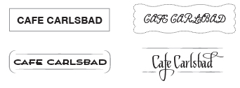
The first thing to notice is that the two words in these signs are identical.
And yet, even with the same information, each has a distinctive “voice.” Each says something different about the business. That difference is in the design.
The signs aren’t just different. Two of them are better. For example, the upper left version is straightforward and legible; it’s also dull as a tall glass of sand. (Is the food dull too?) The upper right sign is an attempt to be cute and homey. But it’s illegible! We don’t pay attention to a business when we can’t read its name.
In the lower versions, some thought has been given to style. Both give the café an intriguing, appealing personality. They say something enticing about the food, the decor, the service. And they say it quietly. That’s how communication design works. Now just imagine what happens when color, graphics, and images are introduced.
So how do you evaluate a communication? How do you assess if its look and feel will enhance your business message or undercut it? That’s what we’ll be talking about in future posts. So stay tuned….
By Doug Katz
![]()
Doug Katz is the founder of JamArtz, an Encinitas, California branding and communication design studio. The firm has been creating artful identities, persuasive messages, and eye-catching communications for businesses, non-profits, and social causes since 1990. Visit jamartz.com or call 760.310.0517.

 Angel Printing, Inc.
in Branding
|
Comments Off
|
Angel Printing, Inc.
in Branding
|
Comments Off
|
 1 Reference
 View Printer Friendly Version
 Email Article to Friend
References (1)
-
 Source: COMMUNICATION DESIGNEDInformative, accurate content is vital. But it’s not sufficient. Because looks matter. The way a communication is designed creates its own impression. Layout, size, graphics, images, typography, color scheme all say something about your company. They can enhance or undercut the words themselves. Subliminally.
Phone: 760.967.0492 | Fax: 760.967. 0496
3614 Ocean Ranch Blvd. | Oceanside, CA 92056
- Printing Services:
Graphic Design
Digital Printing
Offset printing
Web design
Logo design
marketing - book and booklet printing
business card printing
brochure printing
catalog printing
envelope printing
flyer printing
framing - laminating
postcard printing
promotional products
sign printing
sticker printing
eco-friendly. - © 2007 Angel Printing, Inc. Angel Printing, Inc. located in San Diego, California, provides San Diego Printing Services, including: Conventions, Trade Shows and other local Cities / Counties: Alpine, Borrego Springs, Boston, Cardiff by the Sea, Carlsbad, Chula Vista, Coronado, Del Mar, El Cajon , Encinitas, Escondido, Laguna, La Jolla , La Mesa , Las Vegas, Los Angeles, Mission Beach, New York, Boston, Las Vegas, Oceanside, Ocean Beach, Orange County, Pacific Beach, Poway, Rancho Bernardo, Ramona , Rancho Santa Fe, San Marcos, San Diego, Santee, Solana Beach, Temecula (Riverside County), San Clemente, Valley Center, Vista, and the world.
